
This is one of Van Gogh's lesser-known paintings, and I just love it. He used a much thinner paint application than he normally did-- the only impasto (thick) areas are in the butterfly wings and flower petals. Also, much of the raw canvas shows through. I really like the simplicity of this painting and the way the black strokes look almost like calligraphy. Vincent was greatly influenced by Japanese art, which was very popular during the late 1880's.
Here are the steps I take to attempt to make an exact copy of a master's painting:
1. Print out the original proportional to my canvas size (20"x16"), in this case it required (4) 8.5"x11" prints taped together.

2. Cover the entire back with a layer of charcoal. This will serve as my "carbon."

3. Trace over the print, which is taped to the front of my toned canvas. I must be careful not to let any part of my hand rest to avoid smudges of charcoal. The outline of the painting is now transferred to the canvas. Van Gogh toned his canvas with an earth color which is typical for artists to do. I used a mixture of burnt sienna and sap green to tone my canvas (a week ago to let it dry). This shows a close-up of the drawing.

4. As usual-- every source has a different color palette. It is impossible to tell which one is the accurate portrayal of the original. I would have to see it with my own eyes. I'm using the picture from my book, "Van Gogh: The Complete Paintings II" which is part of a 2-book set; a catalog of Vincent's entire body of works he painted. The color palette leans more toward yellow than green and I like the warmth of this version.

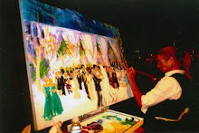
Now-- to the easel I go!
The painting is in the Van Gogh Museum in Amsterdam, and I would love to see it up close and personal. Maybe someday...

No comments:
Post a Comment